
Branding Identity, Packaging Design (2026)
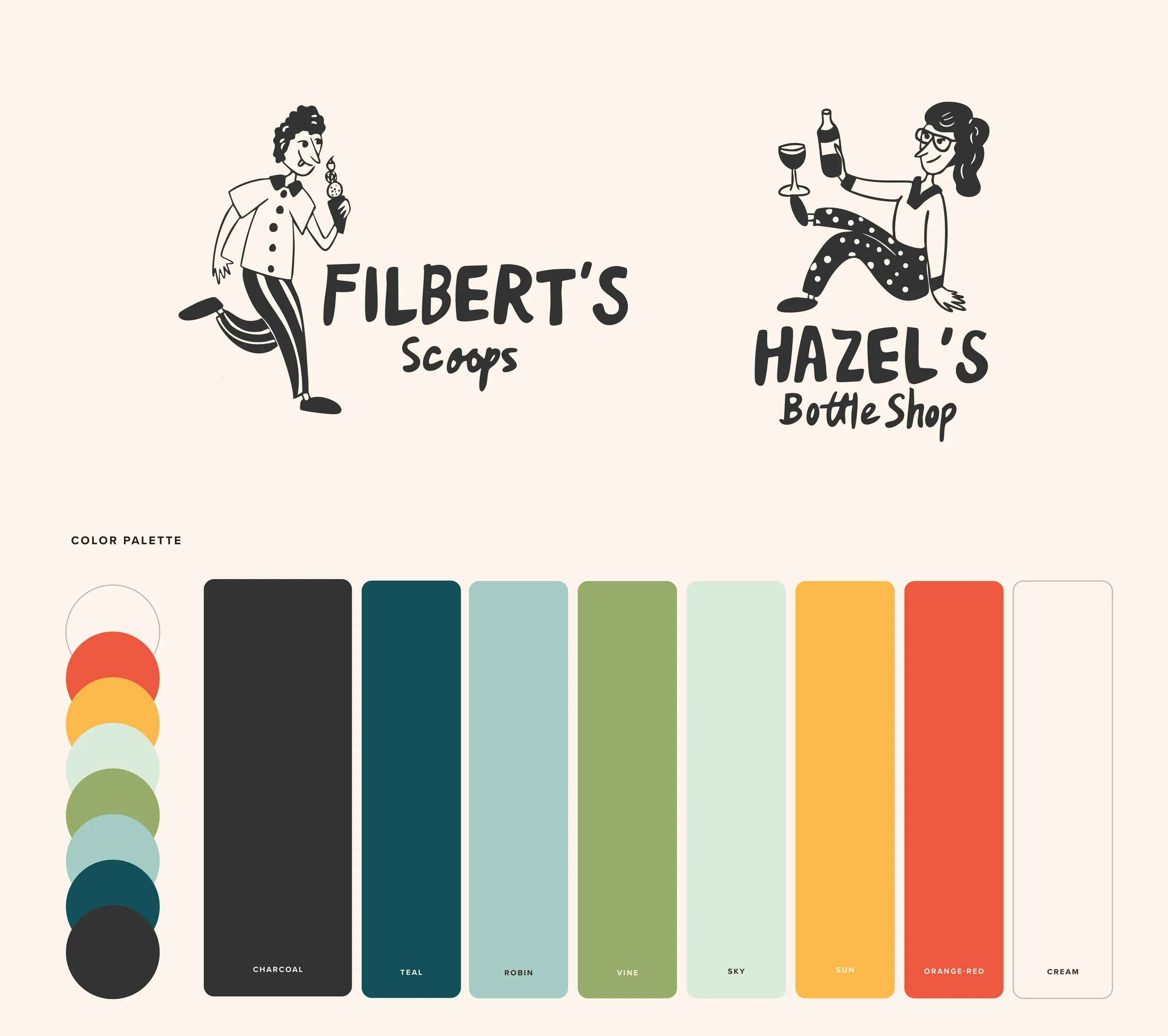
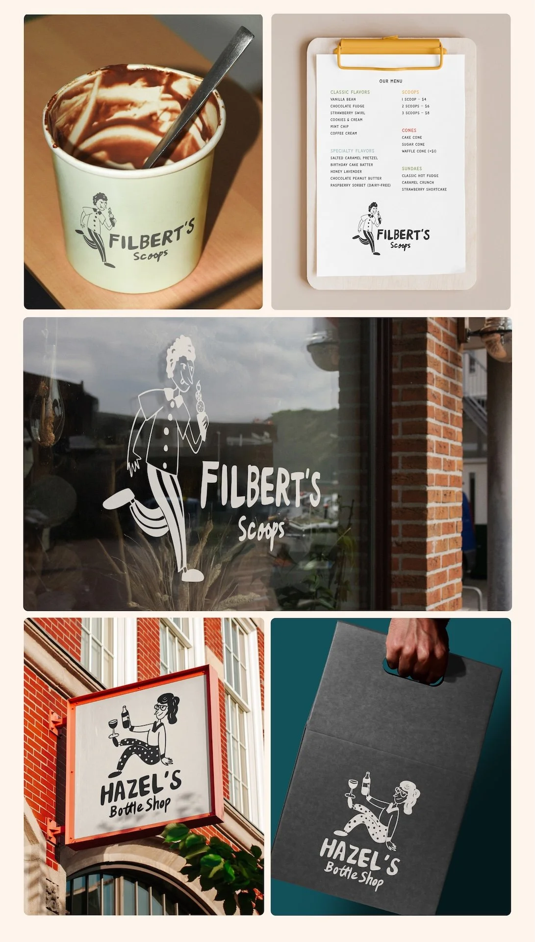
By anchoring the identity in monotone logo usage and layering color through environmental and printed applications the brand achieves both versatility and distinction. The black-and-cream marks establish trust and recognition, while the color palette provides room for creativity, seasonal updates, and visual delight. Together, they form a system that feels classic at its core, but joyful and expressive in everyday experience—perfectly suited for an ice cream and wine shop that values both craft and character.
Filbert and Hazel are hand-drawn brand characters inspired by vintage shop signage and European café culture. Filbert, always in motion with an ice cream in hand, captures spontaneity, joy, and indulgence. Hazel, relaxed and self-assured with a glass of wine, embodies ease, warmth, and lingering pleasure. Illustrated with loose, imperfect linework, the characters feel classic and human rather than cartoonish.
In this brand direction, we’ll lean into the color palette in brand typography, and in-store application: menu design, decorative accents, ice cream cups, cutlery & napkins, to-go bags & pints, and event posters.
Designed through Perspektiiv Design Co.

This project was created through my work at Perspektiiv Design Co., a rad design studio based in Portland OR & Denver CO.